


Naming + Strategy + Verbal Identity
Ooma creates magic mushroom microdose blends to support mood and wellbeing. With them, we set out to present magic mushrooms in an entirely new light—not as indulgent treats, escapist fun, or productivity hacks, but as a transformative wellness practice.
Ooma makes life a bit brighter, so we wanted the name to feel uplifting, like the collective mood brightening. The Ooma name elevates the “oom” in “shroom” to evoke expressions of delight, excitement and energy like “ooh” and “oomph”, representing a joyful mood shift.
With the strategic positioning "The Art of Transformation," we described a practice of elevating mood and wellbeing. We took a feelings-forward approach, communicating with our audience about what matters most to them—how they feel.
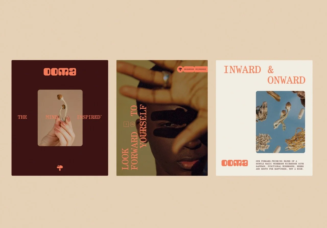
‘The Mind Inspired,’ translates cognitive benefits into emotional ones in a way that’s easy to understand. By ascribing a feeling to the mind, we were able to convey what to expect instantaneously.
To assuage fears for newcomers, we needed a reassuringly clear message. ‘Ritual, Not Habitual. Happy, Not High.’ memorably and playfully addresses two key points of friction, easing concerns about addiction and “tripping out”.
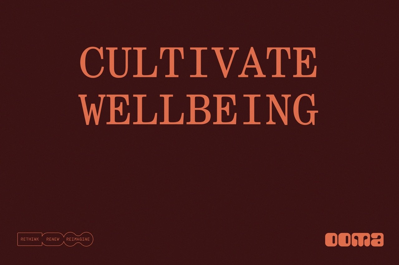
We highlighted ongoing personal growth through the message “For Your Ever-Evolving World,” designed in a circular layout and animated in digital spaces.
Tonally, the brand is modern, elevated and enjoyable, blending imaginative, playful notes with welcoming, guiding tones for the right balance.
While microdose mixes are often called “stacks”, we borrowed the more elevated term “blends” from the wellness world. Rather than talk about cognitive function and neural networks, we defined Ooma’s mushroom microdose blends as intended “for mood and wellbeing” and “everyday ease and enjoyment.”
A variety of brand headlines play with the subject matter, exploring growth, enjoyment and optimism.
The final stanza of the brand manifesto inspired the launch campaign throughline.
Rather than describe individual product benefits, we offered our audience something more inspiring to look forward to—themselves.
You, but in a brighter, better mood as you experience more enjoyment, wellbeing, and personal growth, every day.
With a mix of creative, playful, and reassuring messaging, the brand sparks curiosity, addresses concerns, and invites audiences into the Ooma world.
On the brand website, a combination of design and copy express the brand vision—that we can reimagine feeling, thinking, and being with mushrooms as our muse.
Visit HERE»
DESIGN: KATI FORNER, MATT GRIBBEN /// NAMING + STRATEGY+VERBAL ID+WRITING: ALLISON DOBKIN // WEB DESIGN: KATI FORNER, ALEX WALKER // WEB COPY: ALLISON DOBKIN