


Brand Strategy + Voice + Messaging + Website
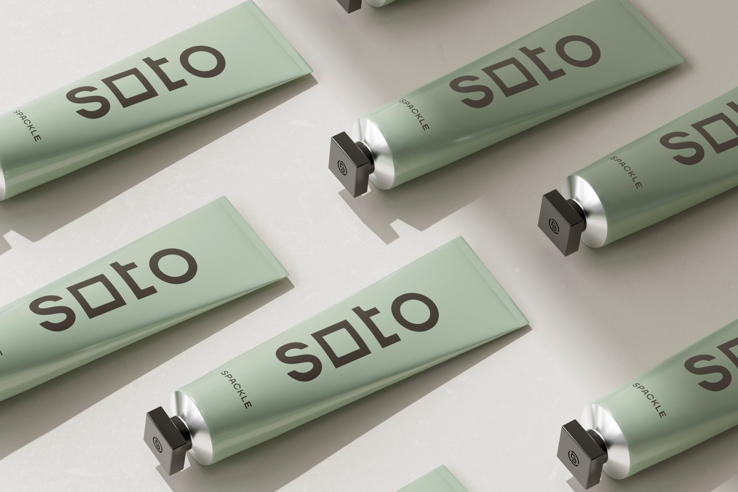
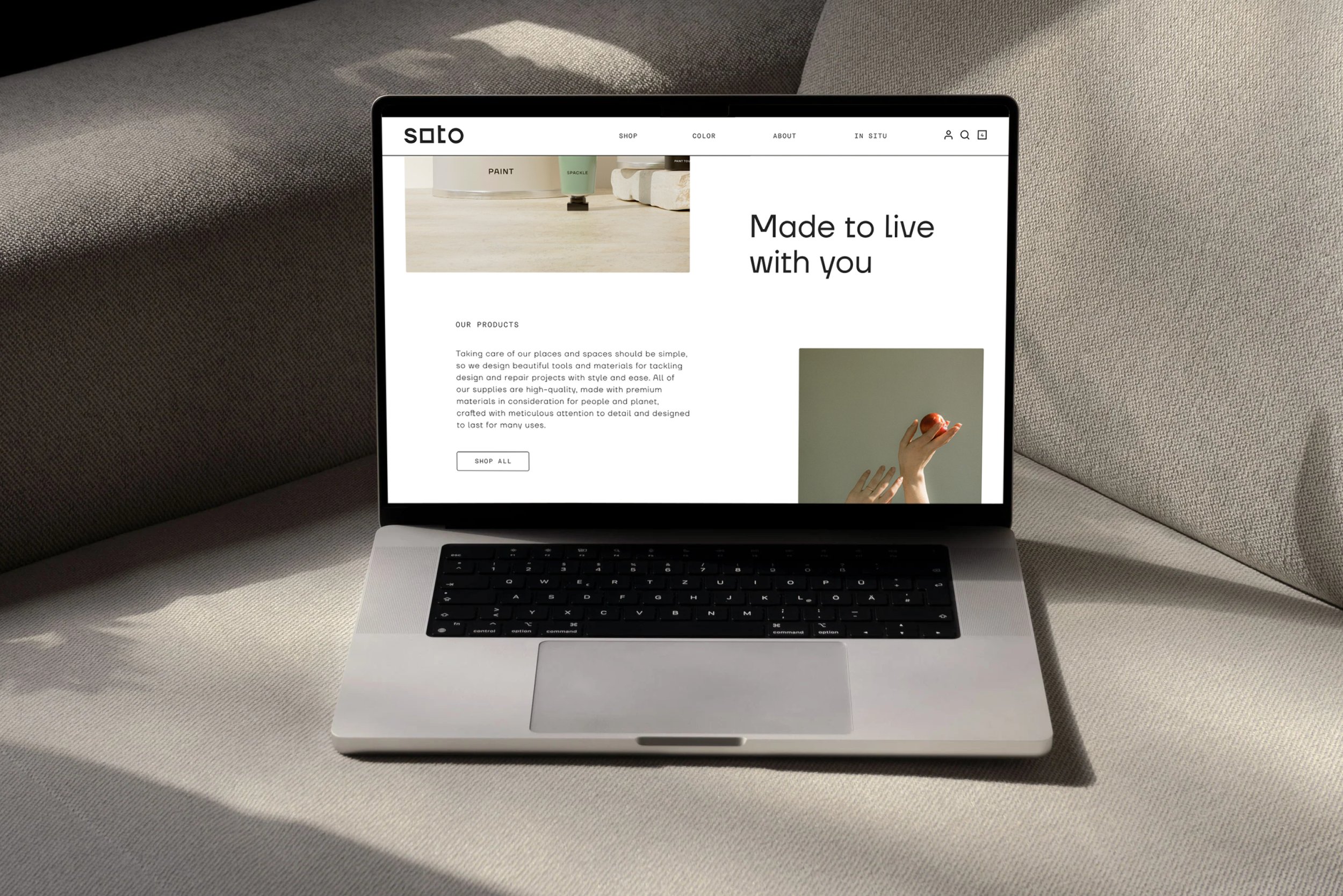
Soto creates home repair and design supplies including paint, spackle and kits. With the overwhelming volume of choices at traditional retailers and big box stores, Soto’s approach is different, with a curated selection for a more considered experience.
Soto asked us to create a home improvement brand that inspired and empowered new projects. The challenge was to elevate the brand while keeping it approachable and welcoming for beginners.
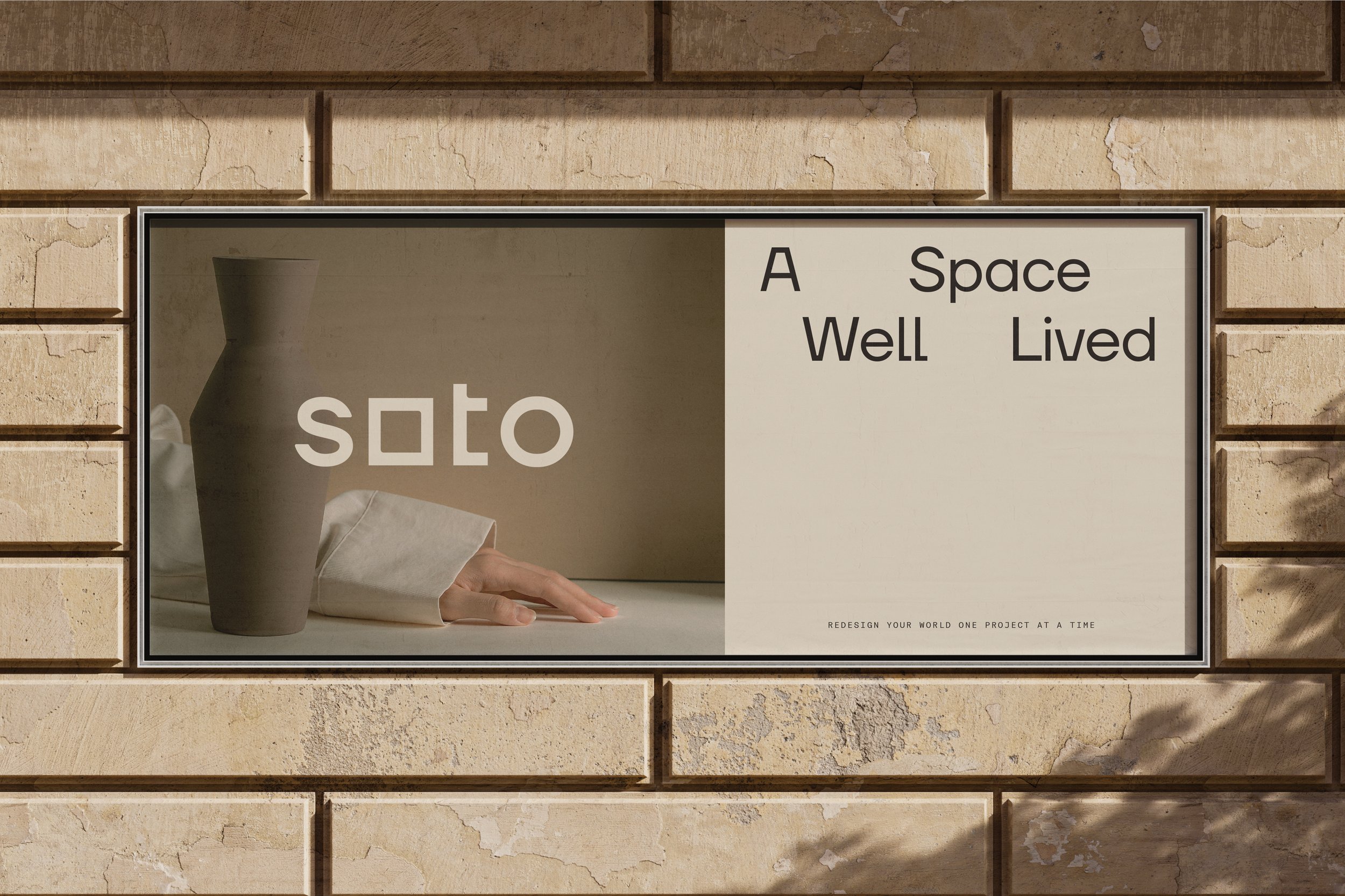
We set out to close the gap between aspirational interior design and functional home improvement categories. We envisioned the new brand as a design house making tools as beautiful as the projects they facilitate.
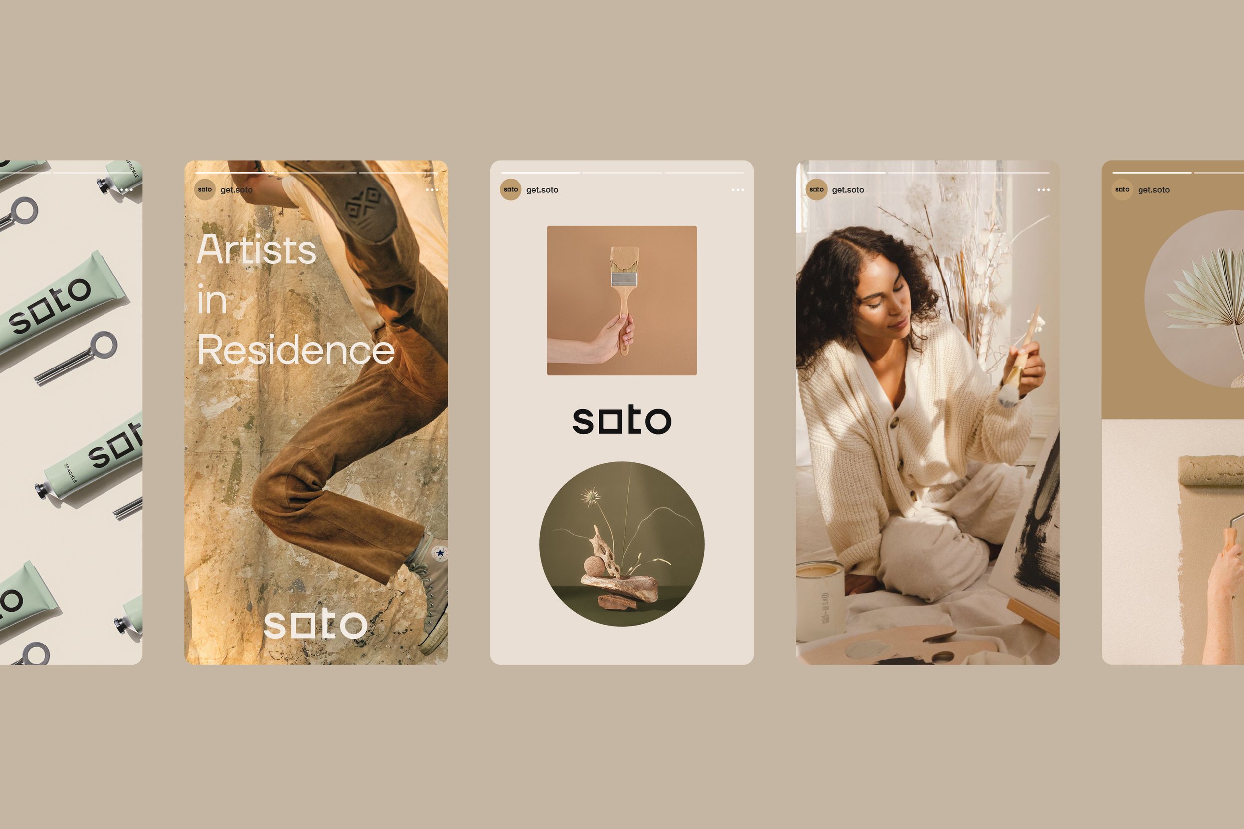
We realized that this audience wants to stay inspired beyond the vision board, during the working-on-it part—the rolling paint, the spackling over holes—that brings it to life. We wanted to help them celebrate the process by making it more artful.
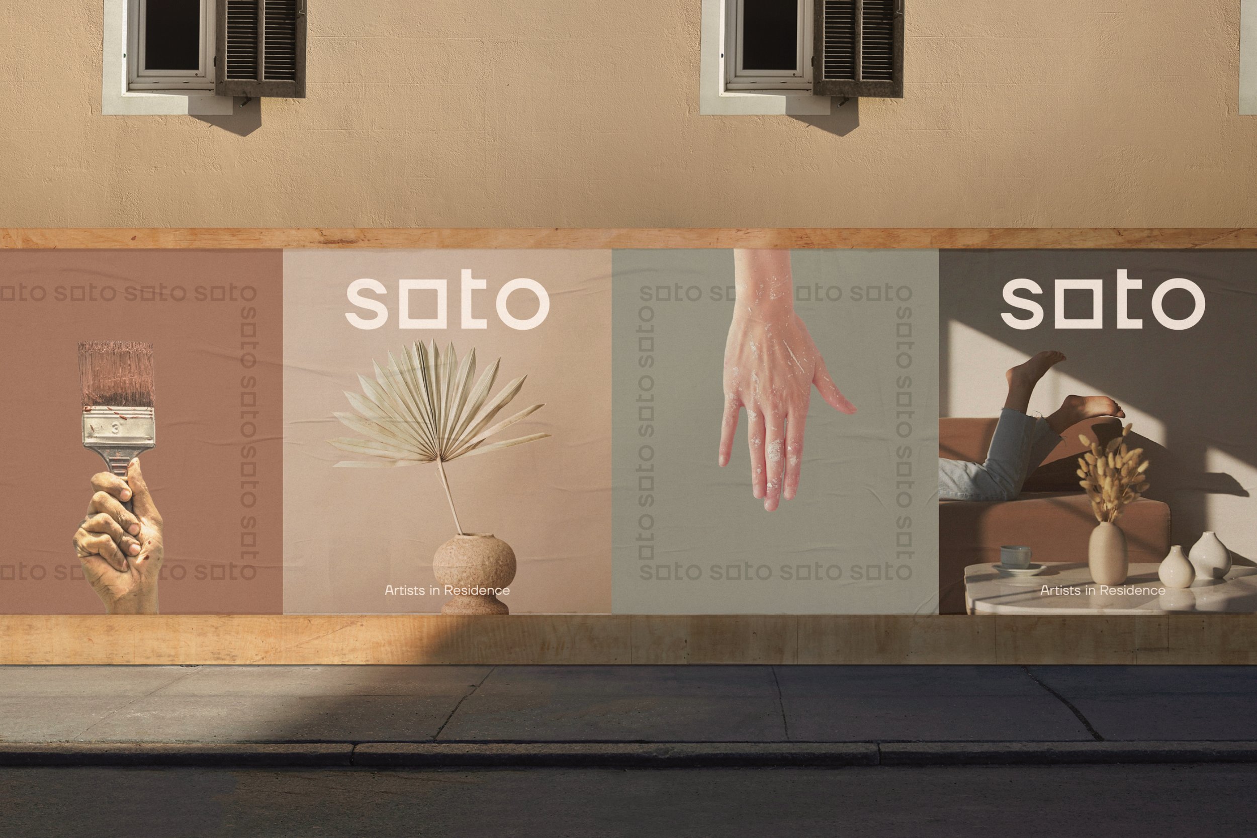
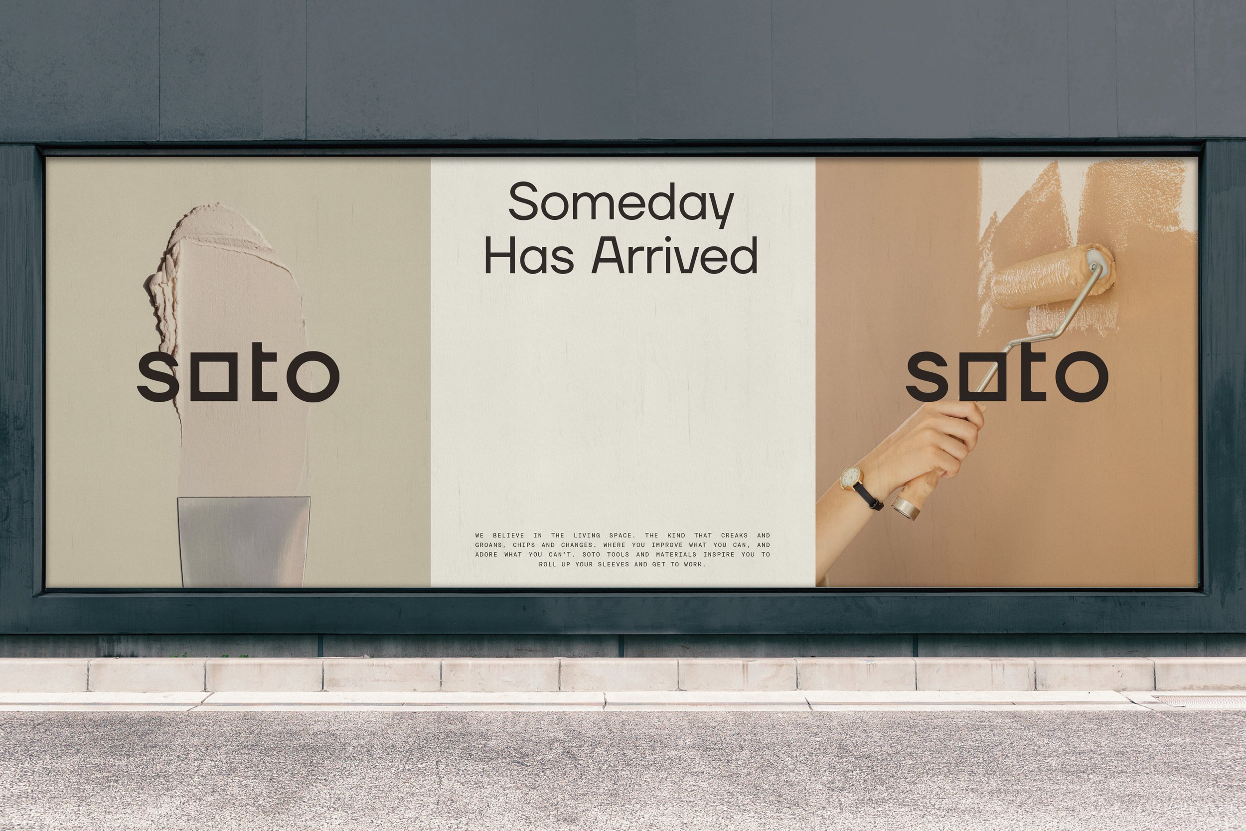
We explored working on your home as a perspective on life, a creative spirit of being in conversation with your surroundings. We called that ethos The Living Space—as the place where you live, and a space alive with its own history & character.
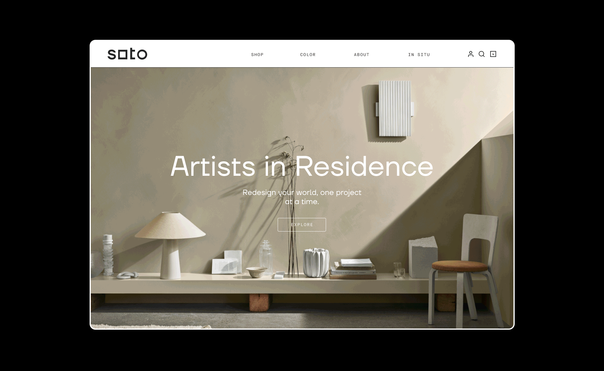
The tagline “Artists in Residence” refers to Soto’s elevated approach, and to the customer as the artist of their homes.
The brand is about more than improving your space—it’s about choosing to use your creative energy to make the world around you better. This foundational philosophy guided all messaging.
From color choices to how-tos, we layered in language that frames home as a creative endeavor. We aimed to inspire people to not only fix up their spaces, but to redesign their world, one project at a time.
Soto considers every aspect of your experience to put home design squarely (and enjoyably) in your wheelhouse.
Since the rebrand, Soto has been picked up by Lowe’s, one of the largest home improvement retailers in the world. They’ve also seen sales double month over month since the brand debuted on the e-commerce website, along with an increase in organic traffic. And that’s AFTER cutting their Google ads budget by 75%.
AD+DESIGN: MATT GRIBBEN // CREATIVE DIRECTION: KATI FORNER // STRATEGY+VERBAL ID+COPY: ALLISON DOBKIN