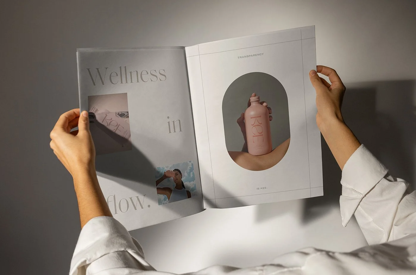
Kee
Strategy + Verbal Identity
Kee believes your wellness routine should flow with your body and life. They’re bringing marine collagen and vitamins into liquid formats for more bioavailable benefits, making endless pills and messy powders a thing of the past.

Strategy
In brand strategy, we focused on flow as our key differentiator, encapsulating the many advantages of liquid delivery: streamlining your regimen, ease of use, and working better with your body.

The strategic positioning “liquid vitamins for pure wellness” sets us up nicely to highlight transparency—no mystery ingredients, additives or fillers. It also speaks to eliminating less streamlined methods like messy powders and handfuls of pills.


Conveying the brand through a liquid lens allows us to create a graceful feeling in messaging and copy that highlights the ultimate ease, purity and power.


Tagline
The tagline ‘Wellness in Flow’ brings the benefits of liquid delivery forward.


Messaging
We brought the graceful feeling of flow to the messaging as well, conveying brand benefits in clear, compelling copy.


Results
Kee carried the foundational strategy, messaging and ethos into their brand website beautifully.
See for yourself HERE »

Created with FORNER studio, 2022.
DESIGN: KATI FORNER /// STRATEGY+VERBAL ID+WRITING: ALLISON DOBKIN
